
The Monica Perez Real Estate Team has partnered with Your Castle Real Estate to provide one-of-a-kind market trends data to help our clients make well informed decisions and identify the best possible deals.
Your Castle Real Estate is regarded as the thought leader in Denver Metro Real Estate. For The Denver Post, we are a trusted source of information, frequently providing background for their real estate articles. Recently, the Denver Business Journal ranked us the third largest realty firm in the Denver area for transaction volume. Unlike the big national franchises, being local owned enables us to customize our approach to the unique needs of our local clients.
Whether you are thinking of selling and want to know the property values in your neighborhood, or you are thinking of buying and want to know the hot neighborhoods, these market trend maps will inform you of the neighborhood details and the overall landscape of current real estate market trends.
The Maps
The map below, created exclusively by Your Castle Real Estate, compares the trends of 2011 to 2010. The overall price of a home in Denver increased about 1% between 2010 and 2011. However, there is a lot of variety from one area to the next.
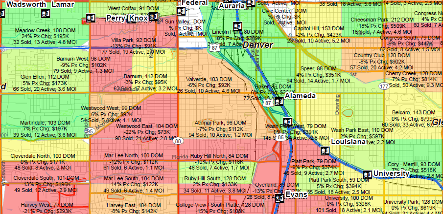
The dark red areas declined 13% or more.
The dark green areas were up 1% or more.
The orange, light green and yellow fall in between these two.
On the micro level, we divided the Denver Metro Area into 400 neighborhoods. The first line of each area has the neighborhood name, followed by the average number of days to sell a property. The second line indicates the percentage of increase or decrease in value over the past year and the average sales price of the neighborhood. The third line states the number of homes sold in the past year and number of homes currently for sale. The final figure “MOI,” stands for the months of inventory in the neighborhood. If there are six months it is a balanced market. If there are more than six months it is considered a buyer’s market and if there are less than six months it is a seller’s market.
Some neighborhoods are still falling while others have already hit bottom and are now on the rise. These maps are updated quarterly, and we have them for every neighborhood in the Denver Metro Area. Request a map of your area.
We utilize this data to analyze your next move and guide the investment you plan to make in your new home.
Tracking the trends by neighborhood and city
The links below contain details on the number of sales, days on market, average price and average discount by neighborhood and city. Information is updated quarterly.
Historical Trends
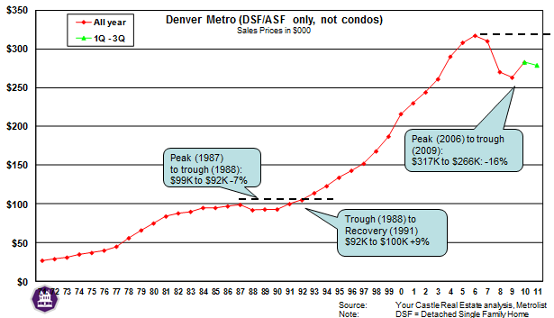
From 1971 to 2008, the average Denver Metro single-family home prices marched mostly upwards, increasing on average 6% per year. From the peak in 1987 to 1988 home prices decreased by 7%. It took roughly two years to recover from the decrease. In 2009, prices were 16% below their 2006 peak. It is too early to conclusively say we are past the bottom, but most indicators reassure that we are now past the bottom of the cycle.
This image depicts the overall summary of market trends in the Denver Metro Area. The property values vary drastically by neighborhood, price point and season. Multiple factors affect property values, such as, level of inventory, percentage of distressed properties for sale, location, property features and property condition. I would gladly meet with you to discuss the market trends in your area of interest and pinpoint how the trends affect your investment.
This information gives you just the tip of the iceberg of available real estate data and trends. Find out more. I am available for Real Estate Market Trend presentations for your office, rotary club or family and friends. Presentations and classes last 15 minutes to an hour, and are tailored to the audience. Please email for more information.